Buying guide
Wabi-sabi decor and Japandi style: a guide
Wabi-sabi and Japandi share a love of calm, natural materials and carefully chosen objects, yet they do not tell quite the same story. Here is how to understand them and bring them into your home without ending up with a catalogue look.
What is wabi-sabi?
Wabi-sabi is a Japanese aesthetic that finds beauty in imperfection, impermanence and incompleteness. Wabi suggests sober, almost rustic simplicity; sabi, the patina that time leaves on things. This sensibility took shape around the tea ceremony, notably with the tea master Sen no Rikyū in the 16th century, who preferred modest, irregular bowls to luxurious pieces.
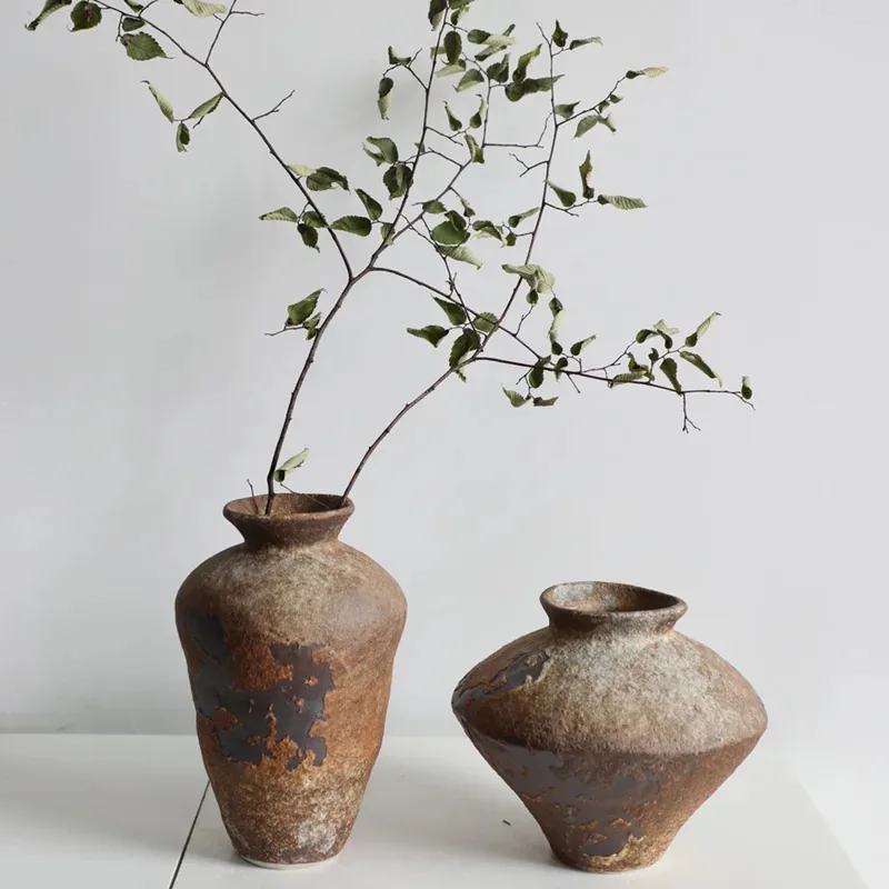
At home, wabi-sabi means raw, living materials: a ceramic with uneven edges, crumpled linen, wood that mellows, porous stone. Nothing is perfect, and that is exactly what makes the whole feel peaceful. Kintsugi, which mends broken ceramics with lacquer highlighted in gold, is a beautiful example: the scar becomes part of the object’s story.
What is Japandi?
The word Japandi is a blend of Japan and Scandi. The style marries Japanese restraint with the warm functionality of Scandinavian design. Expect clean lines, low and simple furniture, light and dark woods, natural textiles and a soft palette punctuated by a few touches of black.
Japandi vs wabi-sabi: the difference
- Japandi is more structured: geometric shapes, careful finishes, well-planned storage. It suits people who love order and clarity.
- Wabi-sabi is rawer and more organic: irregular textures, old or crafted objects, materials that visibly age.
The two work very well together. A Japandi base (simple lines, a calm palette) warmed by a few wabi-sabi pieces (a raw stoneware vase, crumpled linen) gives a home that feels both tidy and alive.
Colours
Start with warm neutrals: off-white, ecru, sand, clay, warm grey and brown. Add deep accents in small doses: matte black, dark brown, olive or sage green. Avoid cold white and bright colours, which break the sense of calm. A useful rule: three or four main shades per room, repeated across different materials.
Materials
- Wood: light oak, ash, walnut; raw or oiled rather than glossy varnish.
- Linen: curtains, bedding, tablecloths and cushions in washed linen, whose natural crinkle embodies the wabi-sabi spirit.
- Ceramics and stoneware: matte finishes, irregular glazes, simple shapes.
- Stone: travertine and honed marble for trays, bowls and candle holders. Our guide how to clean travertine explains how to care for it.
- Paper and fibres: paper lanterns, rattan, rush, raffia. See our guide rattan, wicker, raffia and seagrass.
Lighting: soft and indirect
Light creates half the atmosphere. Choose several low, warm sources rather than one strong ceiling light, with bulbs around 2,700 to 3,000 K. Paper lanterns, popularised in the West notably by Isamu Noguchi’s Akari lights in the 1950s, give a milky, very Japanese glow. A woven paper Japanese lantern over a coffee table, or a linen drum pendant whose weave filters the light, sets the scene instantly. Browse all our .
Empty space and objects
The Japanese concept of ma describes the space between things: emptiness is not a lack, it gives value to what is there. In practice:
- Keep surfaces clear and display only a few objects at a time.
- Group them in threes or fives, at different heights, on a tray that holds them together.
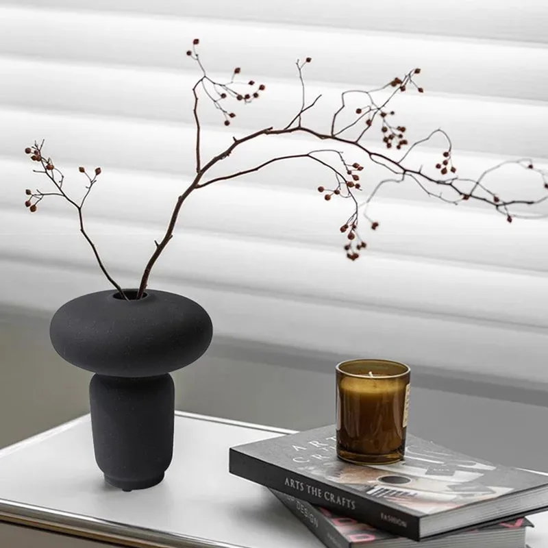
- A single branch in a matte black ikebana vase is enough to create a scene.
- Rotate objects with the seasons rather than showing everything at once.
Branches, dried grasses and plants
Inspired by ikebana, Japandi and wabi-sabi arrangements favour line over abundance: a branch of cherry, eucalyptus or olive, a few dried grasses, a single flower stem. Look for asymmetry and leave space around it. Dried flowers last for months and age gracefully, which fits the wabi-sabi spirit well. For plants, choose one or two large plants with graphic foliage rather than a crowd of small pots.
Layering textures
A neutral interior never looks flat if it plays with texture: crumpled washed linen against bouclé wool, grainy ceramic on smooth wood, porous stone next to translucent paper. This quiet contrast does the work that colour would otherwise do. Repeat each texture at least twice in a room so it feels intentional rather than accidental.
Room by room
Living room: a low sofa in natural tones, a wooden coffee table, a fibre rug, a raw stoneware vase with a few dried grasses. Explore our vases.
Bedroom: a simple, low bed, washed linen bedding in clay or sand tones, a lamp with soft light and nothing superfluous on the bedside table.
Table: matte stoneware, mismatched bowls from the same family of tones, a linen tablecloth or runner. See our tableware.
Hallway: a wooden bench, a woven basket and a stone catch-all: three objects are enough to welcome guests.
Mistakes to avoid
- Piling up “Japanese-style” clichés (fans, characters, potted bamboo) instead of working with materials.
- Painting everything cold white: the room quickly looks clinical.
- Choosing glossy synthetic materials, which contradict the natural spirit.
- Confusing minimalism with austerity: warmth comes from texture, light and wood.
Frequently asked questions
Is Japandi just minimalism?
It is a warm form of minimalism: few objects, but rich materials, warm woods and natural textiles.
Where should you start?
With what changes a room most for the least effort: lighting first, then linen textiles, then one or two objects in ceramic or stone.
Can you mix wabi-sabi with other styles?
Yes. A raw vase or crumpled linen brings a wabi-sabi touch to a contemporary interior, as long as you keep a calm palette.